

Color Theory for Every Room: Understanding How Hues Shape Your Space

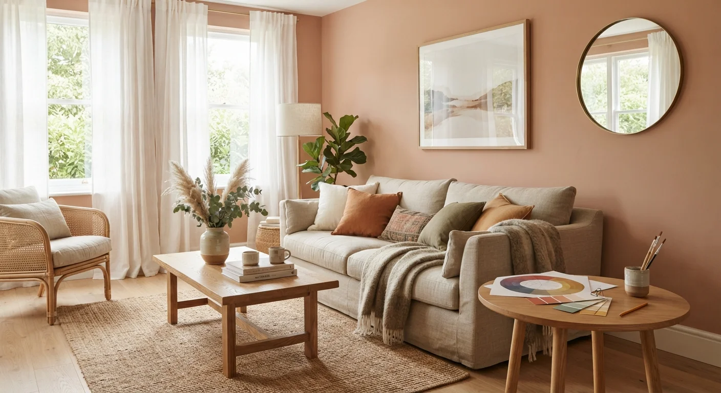
Photo: signaturehomeideas.com editorial
Key Takeaways
- Warm hues (reds, oranges, yellows) visually advance, making a room feel smaller and cozier.
- Cool hues (blues, greens, violets) visually recede, making a room feel larger and calmer.
- Neutral tones anchor a palette and prevent dominant colors from overwhelming a space.
- Lighting conditions change how a color reads on the wall, so always test paint samples in the actual room.
- A 60-30-10 ratio (dominant, secondary, accent) gives most rooms a balanced palette.
- Complementary color schemes create contrast; analogous schemes create cohesion.
How the color wheel translates to a real room
The color wheel organizes hues in a circle so their relationships become visible. Adjacent colors are called analogous (blue, blue-green, green), and they share enough in common to feel harmonious together. Colors directly across the wheel are called complementary (blue and orange, red and green), and they create contrast that makes each hue look more saturated by comparison.
In a room, those relationships translate directly. An analogous palette of warm tans, dusty oranges, and terracotta reads as cohesive and settled. A complementary pairing of navy walls with amber wood tones creates a room that feels lively because each color makes the other pop. Neither approach is universally better; the right choice depends on the function of the room and what mood you want to create.
Before choosing a palette, complete a thorough room assessment. The room styling checklist covers natural light, room proportions, and existing fixed elements that limit or guide your color options.
Warm versus cool: what each actually does to a space
Warm colors (reds, oranges, yellows, warm whites) advance visually. They appear closer than they are, which tightens a room and makes it feel enclosed. In a large, underused dining room, a deep terracotta or burnt sienna on the walls can make the space feel intimate rather than cavernous. In a small entryway, that same color may feel oppressive.
Cool colors (blues, greens, violets, cool grays) recede. They push walls back visually, which adds a sense of openness to tight spaces. A powder-blue bathroom feels more spacious than a crimson one of identical dimensions. Cool hues also tend to read as calm, which is why they appear in bedrooms and home offices more than kitchens.
Color temperature interacts with lighting layers in ways that change how a hue reads at different hours. A warm yellow that looks cheerful under afternoon sun can turn muddy under cool-white LED task lighting in the evening. Test every color in the room where it will live, under both natural and artificial light.
90 sec
Time to form a color impression of a space
Color psychology research broadly suggests people form initial environmental impressions within 90 seconds, with color as a primary driver.
60-30-10
Standard interior color distribution ratio
Interior designers commonly use this ratio as a starting framework for balancing dominant, secondary, and accent colors in a room.
3+ samples
Paint swatches recommended per wall color
Paint professionals generally recommend testing at least three large swatches per candidate color to account for light variation across the day.
Neutrals and the 60-30-10 framework
Neutrals are not colorless. Whites, beiges, grays, and greiges each carry an undertone (warm, cool, or green-leaning) that becomes obvious when placed next to saturated colors or certain wood tones. A stark cool white on walls will make warm honey-colored hardwood floors look dingy by comparison. Choosing a warm white with a slight cream bias resolves the conflict.
The 60-30-10 guideline gives you a practical way to balance any palette. The dominant color covers roughly 60 percent of the room's visual surface (walls, large furniture). A secondary color appears at 30 percent (area rug, curtains, upholstery). An accent color fills the remaining 10 percent (throw pillows, art, small accessories). This ratio creates enough repetition that the palette reads as intentional, with enough contrast to avoid monotony.
Textiles are where secondary and accent colors most often live. The guide to decorating with textiles explains how rugs, throws, and curtains can carry a color through a room and anchor zones without repainting a wall.
Room-by-room application
Color choices that work in one room can fail in another because function shapes what a hue needs to accomplish.
- Kitchen: Warm yellows and warm whites stimulate appetite and energy. Cool blues and greens can also work if the room gets strong natural light, but in a north-facing kitchen they may feel cold.
- Living room: This is the most flexible space for color because it serves multiple purposes. Earthy warm neutrals create an approachable base; deeper accent walls on a single surface add depth without overwhelming. Furniture arrangement and color work together to define zones in open-plan layouts.
- Bedroom: Desaturated cool tones (soft blue, sage, lavender) lower visual stimulation. If you prefer warm tones, keep them muted rather than saturated; a warm blush reads as restful, while a bright coral does not.
- Home office: Low-saturation greens sit at the intersection of warm and cool, which is why they appear in many productivity-focused spaces. They provide visual rest without the drowsiness that very cool, dark blues can produce.
Plants pull green tones into any room, and their presence affects how wall color reads. The guide to indoor plants as decor covers how to choose greenery that complements rather than fights your existing palette.
This article is for informational purposes only. Paint and decor choices vary significantly by lighting conditions, room dimensions, and existing materials. Always test samples in your specific space before purchasing.
Frequently Asked Questions
The content provided on our blog site traverses numerous categories, offering readers valuable and practical information. Readers can use the editorial team’s research and data to gain more insights into their topics of interest. However, they are requested not to treat the articles as conclusive. The website team cannot be held responsible for differences in data or inaccuracies found across other platforms. Please also note that the site might also miss out on various schemes and offers available that the readers may find more beneficial than the ones we cover.