

Furniture Arrangement Principles Every Room Actually Needs

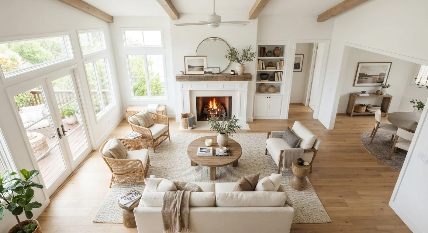
Photo: signaturehomeideas.com editorial
Key Takeaways
- Every room needs at least one clear focal point to anchor furniture groupings.
- Traffic paths should be at least 36 inches wide to feel comfortable and functional.
- Floating furniture away from walls often creates a more connected, livable arrangement.
- Scale mismatches between furniture and room size are one of the most common arrangement mistakes.
- Conversation zones work best when seating faces are within 8 to 10 feet of each other.
Start with the focal point, not the furniture
Before moving a single piece, identify what the room already has to offer as an anchor. A fireplace, a large window with a view, a media console, or even a strong architectural feature can serve this purpose. Every arrangement decision flows from that point outward.
When a room has no built-in focal point, you can create one with a large piece of art, a substantial bookcase, or a grouped console and mirror. The furniture then faces or orients toward it, which gives the eye a place to land. Without this, arrangements tend to feel scattered regardless of how carefully individual pieces are placed.
For open-plan spaces, each zone needs its own focal element to read as a distinct area. See how zoning strategies work in open-plan rooms for a deeper look at that challenge.
Traffic flow and clearance measurements that actually work
A room that looks good on paper can feel cramped the moment people move through it. The standard clearance for a main traffic path is 36 inches. Secondary paths between pieces of furniture, such as the gap between a sofa and a coffee table, can narrow to 18 inches and still feel comfortable.
Walk the room before committing to a layout. Note where people naturally enter, where they move toward (a window, a door, the kitchen), and where they sit. The furniture should work with those lines, not across them.
Pushing all furniture against the walls is the most common arrangement mistake in living rooms. It stretches the room visually and forces people to sit far apart. Pulling seating inward by even two feet creates a more natural conversation group and often makes the room feel larger, not smaller.
Identify and orient toward a focal point before placing any furniture
Keep main traffic paths at least 36 inches clear
Float seating away from walls to create a conversation zone
Size the area rug so it anchors the furniture grouping
Keep conversation seating within 8 to 10 feet of each other
Scale and proportion across the whole room
A sofa that is too small for a wall leaves an awkward gap. A dining table that is too wide for its space blocks movement on all sides. Scale and proportion govern how furniture relates to the room and to the other pieces around it.
A practical starting point: the main seating piece in a living room should occupy roughly two-thirds of the wall it faces or anchors. In a dining room, leave at least 36 inches between the table edge and the wall so chairs can be pulled out and people can pass behind them comfortably.
Vertical space is part of the proportion equation too. Rooms with high ceilings can carry taller furniture and art. In a lower-ceilinged room, tall bookcases or high-hung art can feel oppressive. Using vertical space well is a separate skill worth developing once the floor plan is sorted.
Putting the principles together in practice
Arrangement decisions do not happen in isolation. A room's color, light, and finish choices all affect how a layout reads. Color and tone can make a well-arranged room feel heavier or lighter depending on the choices made.
If you are working with furniture you already own and want to see what a fresh layout can do before spending anything, rearranging without buying is a useful first step. And if your pieces are a mix of styles, keeping mixed furniture styles cohesive covers the visual logic that holds varied pieces together.
This article provides general guidance for informational purposes. Room conditions, structural considerations, and individual needs vary. Verify any measurements and consult a professional where required.
The content provided on our blog site traverses numerous categories, offering readers valuable and practical information. Readers can use the editorial team’s research and data to gain more insights into their topics of interest. However, they are requested not to treat the articles as conclusive. The website team cannot be held responsible for differences in data or inaccuracies found across other platforms. Please also note that the site might also miss out on various schemes and offers available that the readers may find more beneficial than the ones we cover.